I liked the cute old guy leaning on a barrel 
They took both cracker and barrel
i just hope they don’t take Kevin bacon!!
All my crackers (and barrels), gone
US food establishment names are fucking insane
In America they have a restaurant called “Cracker Barrel” and everybody eats from one giant barrel of peanuts and you have to walk through a gift shop to enter the restaurant

A Cracker Barrel was an actual thing though, like it was a barrel filled with pieces of hard tack that you’d see in old timey general stores, which is what Cracker Barrel was going for
Yeah, but it just doesn’t evoke succulent meals vibe. The name gives me dry mouth
It needs a proper name like McDonald’s or Denny’s
woke did this somehow, i just know it
They don’t have a single menu item that is vegetarian or vegan so they can’t blame it on us this time
They actually removed a white man from the logo smdh
chain restaurants desperately trying to stay afloat while not being cheap or good. Cracker barrel is for three groups of people 1. old people who don’t like new things 2. road tripping urbanites wanting to larp 3. rural people who’s only other options are McDonalds and the one local restaurant that isn’t a chain.
I don’t know why corporations do this sort of thing, they always change a recognisable and unique logo into the most generic “safe”
 style logo imaginable. I just don’t understand the thought process here, I guess it’s to try and “appeal” to as large an audience as possible? But the point of a logo is to stick out and be recognisable. I guess I’m just not enough of a rich POS to understand the brilliance behind this sort of thing, since they all do it. Maybe it’s a cargo cult thing, some company made record profits and changed their logo, so it’s just stated as fact that changing your logo like this will magically generate profit.
Most probably the culprit is mobile. Making graphic design portable and readable across multiple screen formats is a bitch. I know this from my brief stint making webpages for a small time student team and it made me realise that I never want to do web dev or be a mobile dev.
Now the design in the left is cooler but the design on the right makes mobile devs breath sighs of relief.
Although to be perfectly perfectly honest fr …
They could have just made 2 versions of the logo, one with the old man and one with the old man removed. Make the latter logo in some vector format (svg? Eps? I’m not sure about the performance difference between formats). Should be mostly fine for most use cases.
But then again, making pointless changes is something PR is known for. Our student team PR committee took 2 months to come to the decision of what kind of website they wanted.
They wanted us to use a “generic corporate template” (their words verbatim).
But then again, making pointless changes is something PR is known for.

If that’s true, they’re falling for the basic “a decrease in pirates caused global warming” causality/correlation trap
They’ll believe in anything to pretend the labour theory of value doesn’t exist.
Useless middlemen trying to justify their positions?
Bingo. Execs can’t just sit on their laurels and watch profit pour in, lest they be perceived as lazy fucks. To appear busy, they need their CVs to include “Initiated and oversaw a major successful rebranding campaign”. By which they mean paying a marketing firm 3 million dollars to move their logo most of the way toward being a colourful blob.
Someone with a stronger background in design and/or art history than me can probably explain it better but I feel like it basically goes back to “apple made a shitload of money with minimalist design under Johnny Ive so that’s what we will replicate for the next few decades because culture in decline and original ideas aren’t good for business”
All I know is every time I complain about how soulless logos and design has become over the past 20-40 years there’s always a sizable contingent of people who reply and vehemently defend this banal soulless flat shit under the guise of accessibility. I don’t get how the right is “far more” accessible and I don’t get how just having clean text in a highly readable font and braille next to the logo wherever possible wouldn’t be far better than any stylized logo for that
My take on the reason is that logos become more abstract in proportion as the business expands and therefore generalizes its products and services.
Amazon started out at something very specific, an online bookstore, but evolved to become just Store in the abstract and universal sense. The old logo becomes a fetter on the brand and has to give way for a more abstract logo that can accommodate all of the different things that the brand wants to do.
Cracker Barrel, as a simple restaurant chain, is limited as a brand. Cracker Barrel as an experience, well that can be anything. They can pivot into anything that vaguely instills the same nostalgic feeling, and if the groundwork has already been done, then consumers won’t be confused or alienated when Cracker Barrel starts selling cars or something. So more and more, Cracker Barrel isn’t a particular thing, it’s an idea. The capitalist tendency toward monopoly necessitates this result, as the very point of branding is to convince you that two identical commodities are in fact distinct and not interchangeable.
In this case it’s likely that they want to get away from the idea that their brand is for old people. Bigger audience.
Yeah, facebook never really recovered from its reputation as a place just for boomers, AI wouldn’t want to end up with the same reputation. They need to capture 110% of the market in order to become profitable.
Blandness aside, there is too much orange space. The name is drowning in orange just like the rest of America

they should’ve gone harder…
shiny chrome font on a field of stars with pastel wireframe. a lens flare from hell peeking around an eclipsed star.
CRACKER BARREL 2099
wrap the restaurant in aluminum/chrome and vinyl, screens and glitchy consoles on every wall, detailing the future war against hunger lead by the sentient android short order cooks of American culture’s last redoubt.
In 20 years they’ll rebrand to just [CB] in a blobby arial font.
They’ll sell Labubus with cowboy hats, and Cool Ranch Doritos-flavored biscuits.
and Cool Ranch Doritos-flavored biscuits.

Yeah I’d try that
That’s the most surprising thing: their app icon style redesign doesn’t use a generic sans serif font/typeface/etc. Maybe the fashion wheel has finally started turning and we’re entering a cycle where serifs are ok again.
this is the recession indicator
Looks like a shitty knockoff Denny’s now lol
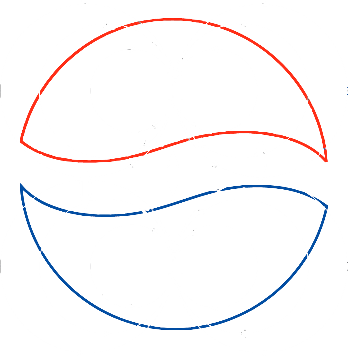
they finally got him in the barrel and there are no more crackers left for the sign

Not to mention someone got paid a not insignificant sum for doing this as well
“lets make our old people restaurant less appealing to old people”
