UnderpantsWeevil@lemmy.world to politics @lemmy.worldEnglish · 2 months agoMilitary spending is up, social and economic funding is down since 2022hexbear.netimagemessage-square26fedilinkarrow-up178arrow-down170file-text
arrow-up18arrow-down1imageMilitary spending is up, social and economic funding is down since 2022hexbear.netUnderpantsWeevil@lemmy.world to politics @lemmy.worldEnglish · 2 months agomessage-square26fedilinkfile-text
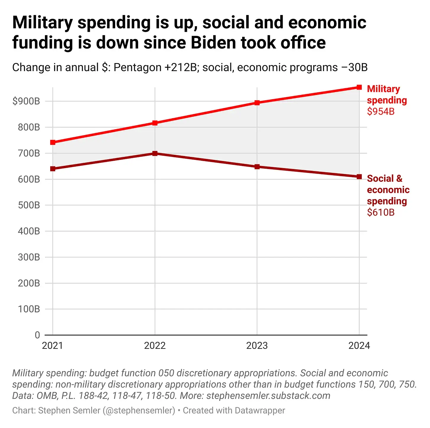
minus-squareyesman@lemmy.worldlinkfedilinkarrow-up1arrow-down1·2 months agoThis chart is misleading. It just shows “discretionary” spending which leaves out Medicare Social Security, and Medicaid. (We spend considerably more on those programs than the entire military)


This chart is misleading. It just shows “discretionary” spending which leaves out Medicare Social Security, and Medicaid. (We spend considerably more on those programs than the entire military)