Life on planet Earth is under siege. We are now in an uncharted territory. For several decades, scientists have consistently warned of a future marked by extrem
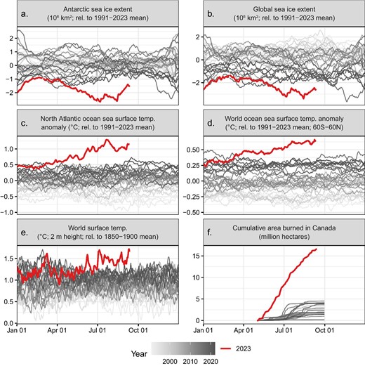
Ok, ignoring the horrifying nature of all of the data… Man I really love that shading intensity of grey to show age of the line on the temp and ice extent graphs.
It actually does a really good job of showing how there was already a distinct trend upwards in average temps even if it was slow and consistent across the whole year and helps visualize those years of data better.
Anyways back to internal screaming I guess.