Disclaimer! Work In Progress! See source code. I recently read this wonderful blog post about using 17th Century Dutch fonts on the web. And, because I'm an idiot, I decided to try and build something similar using Shakespeare's first folio as a template. Now, before setting off on a journey, it is worth seeing if [...]


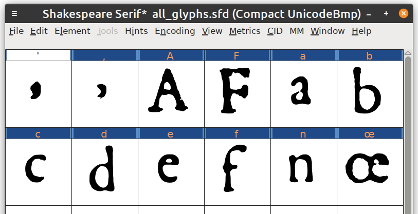
This is such a great project! I can see how there’s a little room for clean-up on that long S. Plus the comma-looking apostrophe 😵💫. Although maybe that’s how that punctuation mark acted back then?
Nah, that’s just me not adjusting the positioning of the apostrophe. Lots of clean-up to do :-)